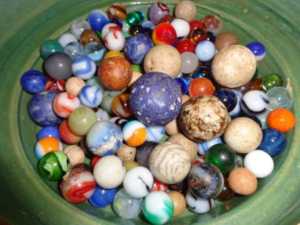
If you’ve ever noticed the basic colors of most antiques or vintage items, you’ll find that it’s hard to locate many in the bright primary colors of red, blue, or yellow. Are we too used to faded colors?
We love the bold colors in the simple shapes that were especially dominant in the 1930-1950 period. Did the hardships of the Depression and World War II create a need for clean lines and bright colors, or was it just the developments in industry that allowed more color in the manufacturing process?
We can find colorful marbles, of course, going back much further, especially those made by glass makers. But it took the pottery makers like Homer Laughlin, Bauer, Clarice Cliff, Myott, Susie Cooper and others to move us into simple Art Deco shapes and bright colors during this period. Children’s toys became brighter. Fanciful chenille bedspreads served as resting places for colorful peacocks. All sorts of cookie jars and salt and pepper shakers were made to look like everything from teddy bears to roosters. Even kitchen mixing bowls by Pyrex came out in all kinds of colors.
Looking back on it we can’t help but smile. In the face of economic hardship and the terrors of a world war, bright colors bloomed. Today they still can lift the spirit. All it takes is clean lines and bright color.
We’d like to thank Mary, Barbara and Whitney for sharing their photos with us all. It always brings a smile when we see that the things our readers collect are bright and can bring smiles.


These are some of the records from Dusty Old Thing’s own family.

Ok, we’re adding pink and a muted green and white to this fantastic yellow art deco pitcher. They all are classics. And what a wonderfully fun thing to collect.
